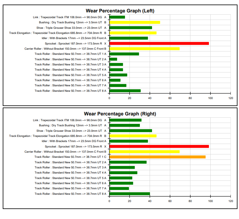
Graph illustrating the wear percentage of equipment components over time, helping TrackTreads users track condition and make informed asset management decisions.
Graph illustrating the wear percentage of equipment components over time, helping TrackTreads users track condition and make informed asset management decisions.